How to paint your fence with the climate.

I’ve painted my garden fence in Norwich to represent the changing climate recorded in nearby Lowestoft over the past 100 years. The design is relatively simple. There are just four colours, dark blue represents 8 degrees C, light blue 9 degrees C, light red 10 degrees C and dark red 11 degrees C. The design is inspired by, but simpler than, the warming stripes developed by climate scientist Ed Hawkins and used by the BBC to identify their climate coverage during the recent COP 26 climate summit. The design and painting were not too tricky - maybe you could do something similar on your fence or one at your school or university ?
Where might you get the temperature data from ? One option is the UK Met office historical climate data collected at 37 long-running weather stations. Temperatures have been recorded just down the road from me in Lowestoft for more than 100 years. The data can be downloaded online, giving the monthly maximum and minimum temperatures. I calculated the midpoint between the extremes per month and then used that that to calculate an average for the year. The number of slats that needed painting on my fence was, coincidentally, very close to the number of years of available temperature data.

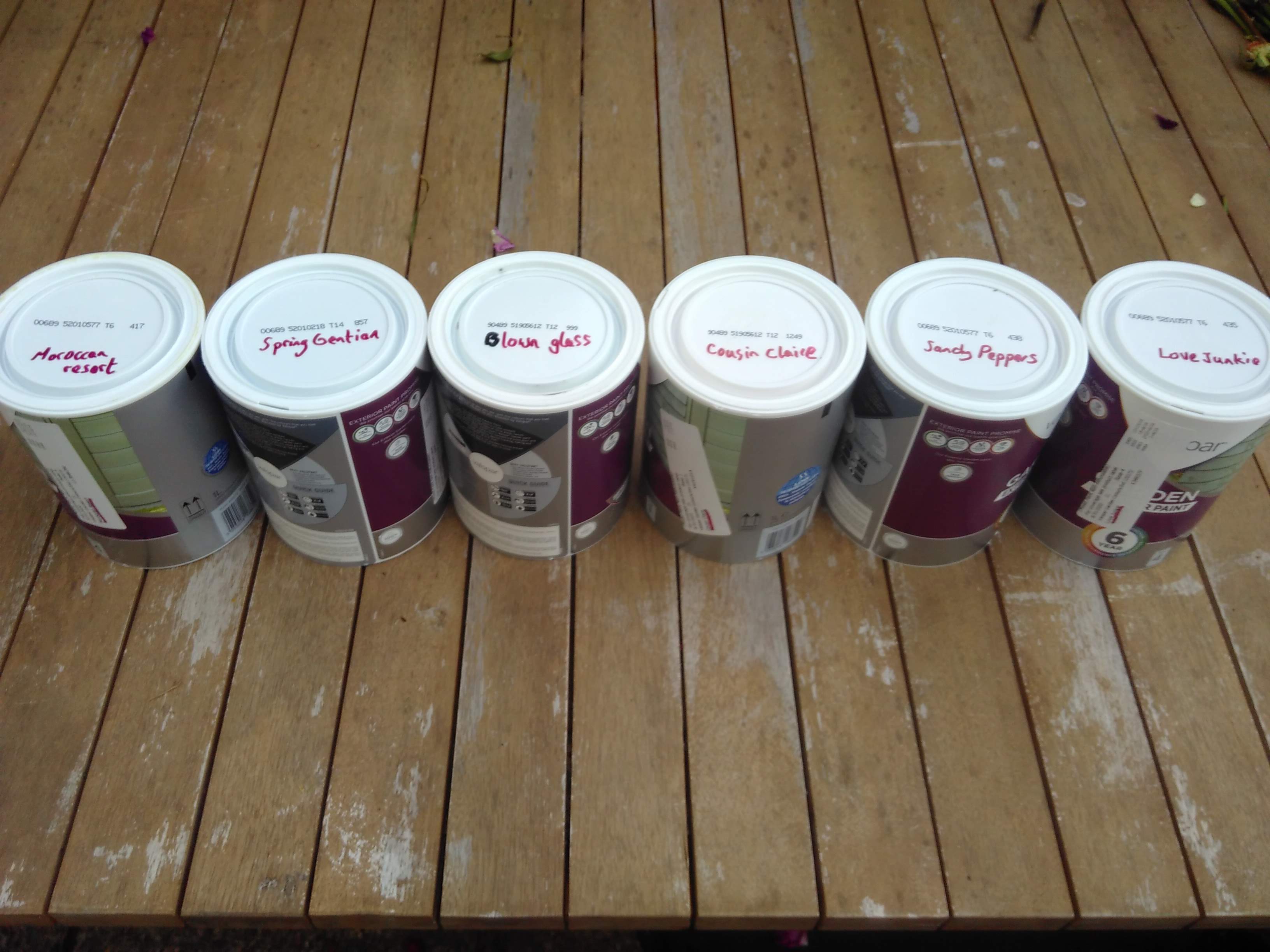
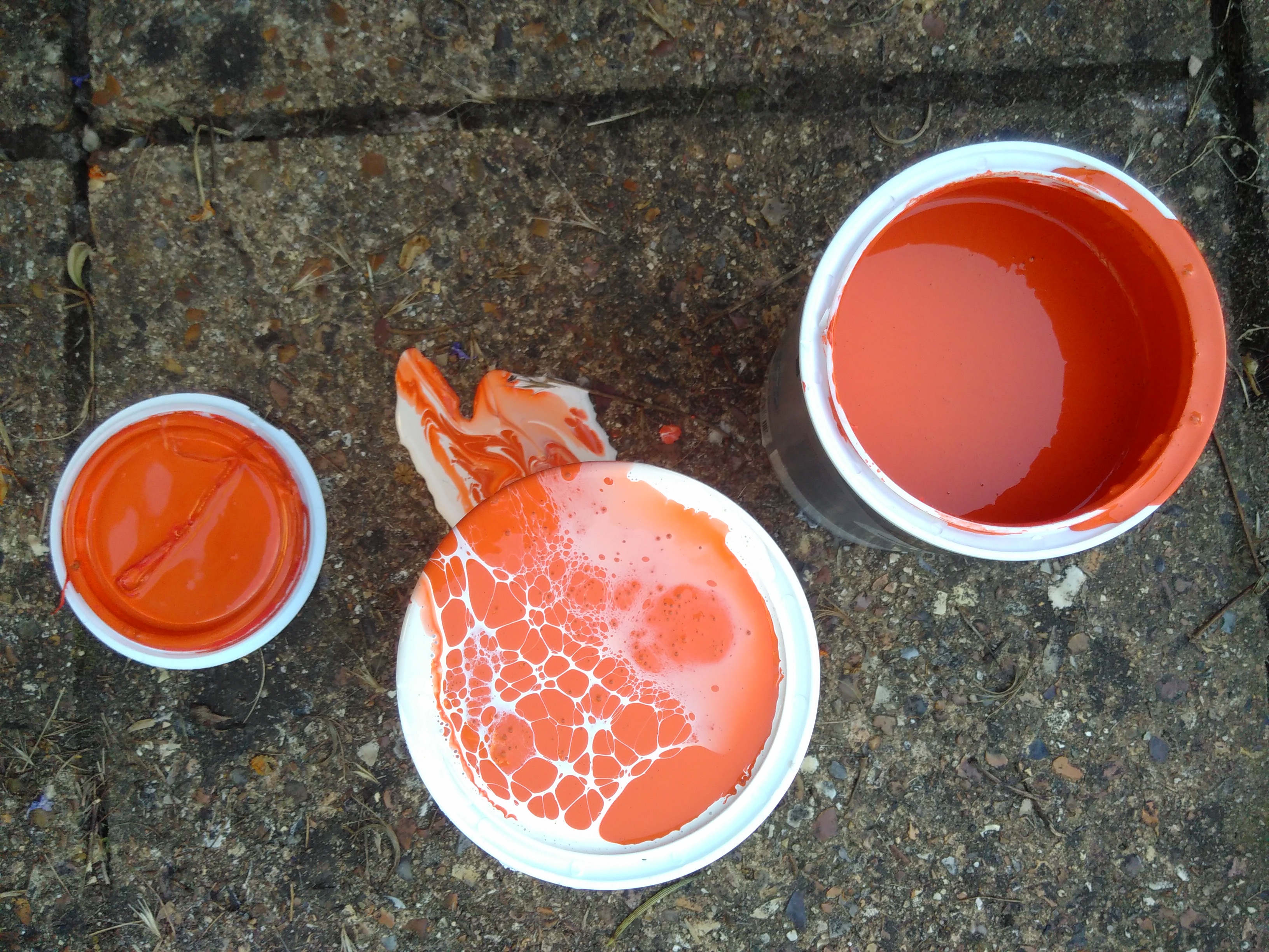
I’m a big fan of an open-source data programming language called R. Some R code kindly shared online (by Dominic Royé - a climate scientist based in Spain) allowed me to experiment with different colour plots. When there was a paint sale at a local DIY superstore I went out & bought 6 different paint colours - three reds for hotter temperatures and three blues for colder temperatures.
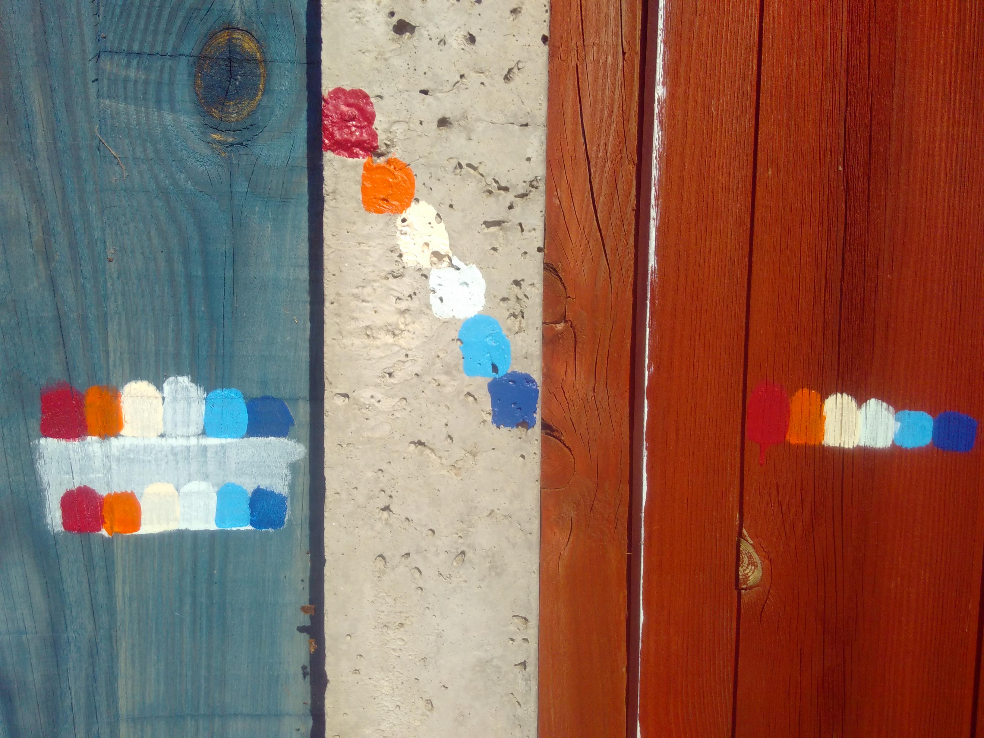
Further plotting on the computer, and a consideration for how long it was going to take me to do the physical painting, suggested that using 4 colours might be better than 6. To adapt to this change of plan, I used one of the colours as an undercoat on the whole fence, and haphazardly mixed two to create a shade that better matched my vision (but is not particularly liked by my partner !).

The physical painting process was a joy. It was done in short sessions and our children, then 6 & 7, enjoyed doing a bit. Ironically it only got finished in 2021 due to an unusually warm & dry September. It was great to chat to people passing.

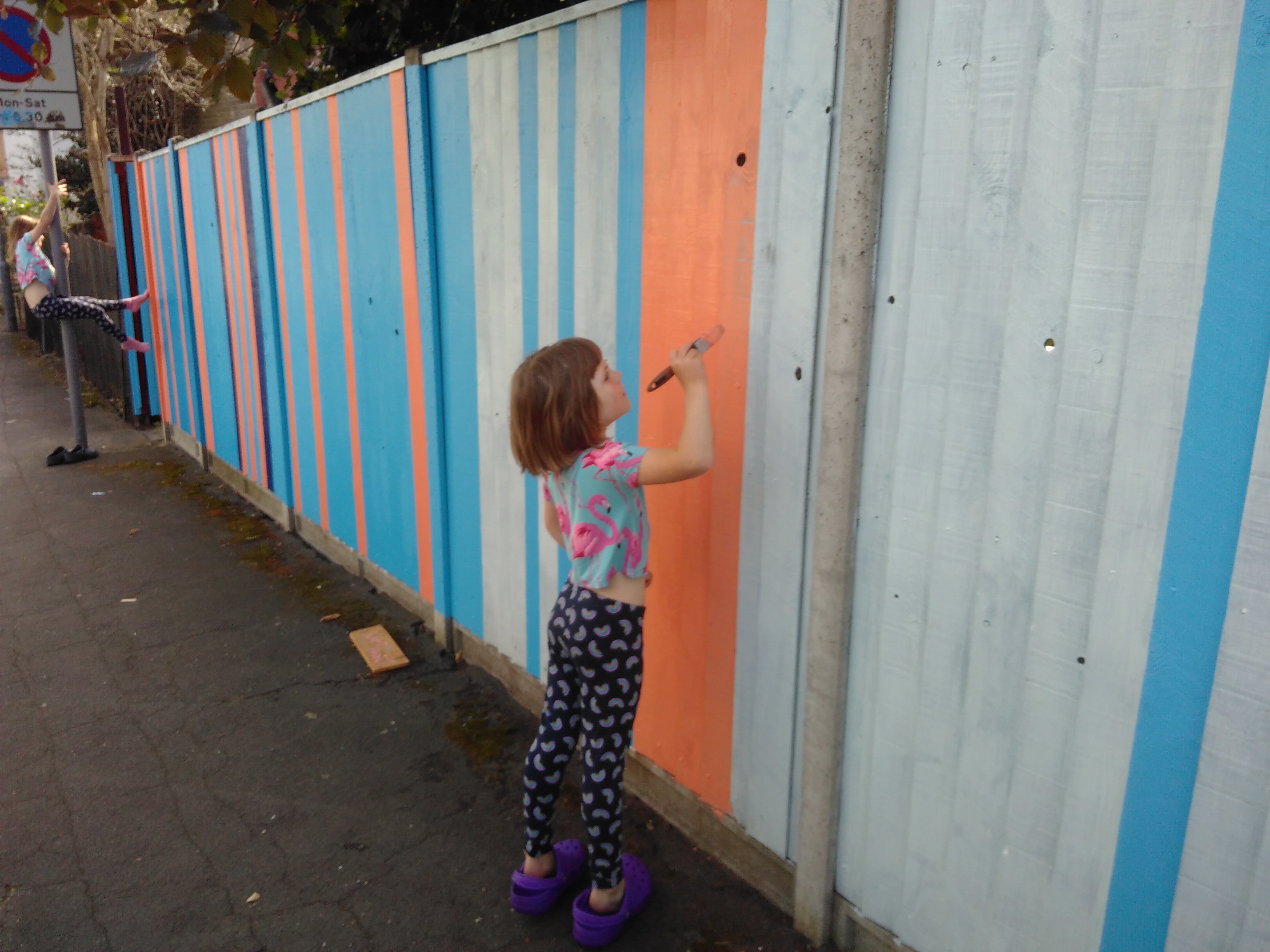
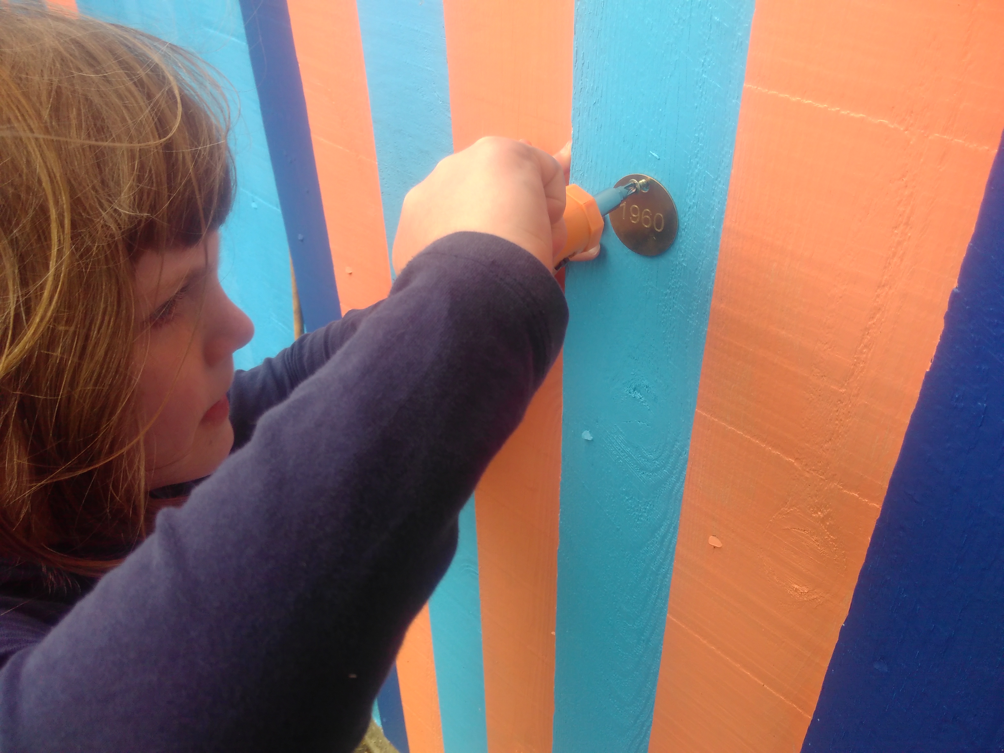
To help with interpretation we added some brass dog tags engraved with the year at decadal intervals - placed at a height that they will be best visible to children.

A number of things about how the project evolved really please me. The pattern was even starker than I imagined it would be. Passers by on the street when we were painting really liked the colour - even before they knew what it was about. Because it just uses 4 colours, it would be relatively easy (and not horrendously expensive) to get the paint and do something similar yourself. I’ve made the open-source computer code available online so that others could repeat or modify for different areas. In this case the fact that the temperatures corresponding to the different colours came out as nice round numbers, 8,9,10 & 11 degrees, makes it relatively easy to explain to people on the street. You could choose different shades to represent hot & cold. It could be an instructive project in a school setting, combining science, art, data and computing. Schools often have plenty of fence available.
I’m available for climate fence painting consultation !

I’m writing a longer more technical blog post too.